Add ability to manually set image dimensions #5812
Conversation
 noisysocks
added
[Type] Enhancement
noisysocks
added
[Type] Enhancement
|
This differs from the design a little: instead of the Dimensions label, I made the width and height fields each have its own label. It's generally good a11y practice for every input to have a label. Let me know if you hate it and I'll figure out a way to have labels for each field but still have the UI look like the mockup! 🙂 cc. @jasmussen |
|
Nice, thank you for working on this! CC: @karmatosed First thought, the pill button is a really nice interface for this. GIF:
Some issues:
Otherwise, really nice work, and good interface. |

|
Just a thought: If we offer the user an easy way to edit the image dimensions, they will use that and potentially break a lot of designs without knowing why. I believe, that this can be very hurtful in a responsive situation. Has there been any consideration to that? Otherwise, great work! 👍 |
@Luehrsen whilst I can see the concern there, I think it's important to balance giving control. In some cases yes issues could happen, in many this won't be the case. Another point to note is responsive wise as long as we handle images and also the theme does properly, this shouldn't cause issues - fixed !important widths is where they fall over. It's good to be mindful but this is a feature people want and safe enough to empower. @noisysocks great work on this, really cool to see it taking shape. @jasmussen I agree with greying out actions on start, if you can't do then don't show active.
That would be amazing :) |
My mistake. I misinterpreted #4914 (comment) and thought that intrinsic dimensions meant the original size of the image file, i.e. what you see if you select the file on your computer and press ⌘I. I've updated this PR so that clicking e.g. 50% sets the width and height to half of the size of the image as it appears in the visual editor. Note for code reviewers: Doing this involved re-arranging a bunch of code so as to pull the
I've changed it to a lighter grey. Should we also change the colour we use for other input placeholders throughout Gutenberg (or wp-admin)? e.g. Search for a block in the inserter and Add New Tag in the document settings
I could use some help with this. It's to do with how we set |
👍 👍
I was indeed referring to the placeholder text. And yes, ideally any changes we make here we make across all input form fields in Gutenberg. The color looked so dark it didn't look like placeholder text to me. But given the fact that it was placeholder text, perhaps it's best to address this separately? I'm currently working on some unification in #5605, perhaps you can revert your fix and I can revisit in that PR? |
These are the inline styles we output, correct? This keeps coming back to bite us. CC: @mtias — I'd love for us to be able to rid of the inline styles, or at least find a way to add nuance here. #5460 is one attempt at improving things for floats. There's also discussion in #5706 (review). A plan B is to simply unset those styles, as soon as you explicitly set the dimensions using this tool. |
👌 done. |
|
Had a quick look at this branch, nice work, it's nearly there. I just pushed a fix that adds the following: The problem used to be that if you manually set a width or height that broke the intrinsic aspect ratio of the image (say setting a size of 100x100 on a 300x200 image), this would not work. This is because using the resizing tool we use, these properties are set on the parent The change I just made in c731101 overrides that if an image is resized, i.e. the image has the
Note how it works right up until the end. This is because if you resize using the drag handles, then The only missing piece is that if you manually set the dimensions on a fresh image (i.e. insert new image, don't resize using handles or pillbox, then set dimensions explicitly), then As such, the remaining step is to do that — set |
|
Just throwing ideas out there, but it would be nice if next to the Width / Height inputs (Right side of Height?) was a little lock icon (With a tooltip with something like 'Lock/Unlock Aspect Ratio') and when pressed it would enable/disable locking of the aspect ratio for the image. So if you were to change the width or height, then the other input would automatically update to retain the aspect ratio of the image. I know from past experiences with clients who adjust the size of images, lack of such a feature does tend to produce some stretched out images for no reason. |
|
Yep, love that idea Paul, had similar thoughts. But such an enhancement should probably be separate from this PR. |
|
Agreed it should be an additional PR. Just wanted to make sure it was a consideration. :) |
blocks/library/image/block.js
Outdated
| render() { | ||
| const { attributes, setAttributes, isSelected, className, settings, toggleSelection } = this.props; | ||
| const { url, alt, caption, align, id, href, width, height } = attributes; | ||
| renderBlockControls() { |
There was a problem hiding this comment.
Minor: Just wanted to share my concerns about this pattern: (render*) functions. I think this probably indicates that we need to split this into smaller components. I think this pattern makes it hard to maintain the component without having an obvious pro.
There was a problem hiding this comment.
Also, this is something we'd want to be consistent across core blocks, because people will learn from them.
There was a problem hiding this comment.
Yeah, I also don't very much like this pattern. I opted for it instead of splitting the block into smaller components because there was a lot of codependency on local state. Looking at it now with fresh (post-Easter) eyes, though, it doesn't look like it would be so bad to pass props around. Watch this space...
|
I've noticed a slight visual bug in Safari (Seems fine in Chrome) where the placeholder text inside the width/height inputs is different than actual input text. This seems to due to core forcing Adding Other than that, it looks and works great. |
noisysocks
force-pushed
the
add/image-dimensions
branch
from
c731101
to
dea294d
Compare
Thanks for looking into this @jasmussen. I've made it so that:
I think everything is looking great on the editor side of things! 🎉 On the frontend, though, we have the same issue where images ignore any stretched aspect ratio that you enter. We can't do what we do in the editor (set an explicit
Thanks @paulwilde! I've added your fix in dea294d. |
|
@noisysocks see the implementation of font-sizes for potential inspiration. We could set classes for the fixed percentage values and size with CSS relative to container. If user chooses a custom value we'd save as inline width/height. Also cc @azaozz for thoughts on relationship with responsive images. |
noisysocks
force-pushed
the
add/image-dimensions
branch
2 times, most recently
from
a4f41d0
to
e5b0a65
Compare
|
Valiant work. This works mostly well. I think it's 99% there. But there are still some edgecases, and I think we actually need to get #5973 merged in first, then rebase this PR off of that. Because right now in the editor you are setting the width of the Also recorded a GIF that shows some iffiness. The key here is that so long as we set inline dimensions on the figure, things blow up in strange ways. If we merge in #5973 first, the figure will have The good news is that overall, you got the behavior right. The pill button is a shortcut for filling out the image dimensions:
By the way can you add an "Image Dimensions" label? Something like this:
Perhaps Bold as well. |


 noisysocks
force-pushed
the
add/image-dimensions
branch
from
noisysocks
force-pushed
the
add/image-dimensions
branch
from
f7a8745
to
2d6dde6
Compare
|
Thanks @jasmussen. I've cleaned up this PR and added the label you requested. Let's wait for #5973 before continuing 🙂 |
- Fixes Reset button being too tall on mobile in the paragraph and image
  inspectors
- Makes the margin at bottom of a <ButtonGroup> consistent with all
  other controls (1em)
- Fix regression causing width and height fields from being too close to
  each other
Let the <figure> get its width from the fit-content rule that was added
in 2dc9fb3.
noisysocks
force-pushed
the
add/image-dimensions
branch
from
b268f8b
to
33a4bed
Compare
|
Hey @jasmussen. I pulled in #5973, removed the inline |
|
Very nice work. This is 99% there. Floats work, resizing works, shortcuts work, obscure manually typed dimensions work. I did encounter one Editor-only issue, which is a little hard to explain, here's a GIF. Before you watch, though — I'm pretty sure it's my fault, and this issue is in master also. Going to look in a minute. GIF:
It looks like if an image is inserted fresh, in the editor no explicit dimensions are set on it. This is effectively the same as what the Reset button should do, completely untouched, meaning that if you resize the viewport our Editor responsive styles kick in and resize the image if need be. However at some point, and it appears to be as soon as you interact with the image in some way, a bunch of inline styles are set on the image — again, editor only. This means that even if you later on press the "Reset" button, those styles are still present in the editor, misrepesenting the image dimensions. For example try these steps to reproduce:
It's interesting that this issue is surfaced now — I think it's due to the fit-content property I introduced. It seems like our resizing library sets the dimensions on the div instead of the img:
|


|
Given that the issue I discovered seems to be separate, I opened a ticket for it. And unless @youknowriad objects, we should probably address it separately: #6191. In other words, I think this branch is good to go. |
|
Thanks @jasmussen! Agree we should look into that issue separately—thanks for ticketing. @youknowriad—would you mind glancing over this? The code has changed a little bit since you last reviewed it. |
blocks/library/image/block.js
Outdated
| @@ -220,10 +224,69 @@ class ImageBlock extends Component { | |||
| onChange={ this.updateImageURL } | |||
| /> | |||
| ) } | |||
| <div className="blocks-image-dimensions"> | |||
There was a problem hiding this comment.
I feel that these classNames don't follow our guidelines, should it be blocks-image__dimentions?
blocks/library/image/block.js
Outdated
| label={ __( 'Width' ) } | ||
| value={ width !== undefined ? width : '' } | ||
| placeholder={ selectedSize.width } | ||
| onChange={ ( value ) => { |
There was a problem hiding this comment.
Minor: I know this is not the first usage of arrow functions as props here but since this is already a class, we could use bound methods instead.
| @@ -239,7 +302,11 @@ class ImageBlock extends Component { | |||
| const img = <img src={ url } alt={ alt } onClick={ this.onImageClick } />; | |||
|
|
|||
| if ( ! isResizable || ! imageWidthWithinContainer ) { | |||
| return img; | |||
| return ( | |||
| <div style={ { width, height } }> | |||
There was a problem hiding this comment.
This changes feels a bit weird, we're adding an unnecessary extra div for me and I believe this div is not present in the "save" representation? Can we avoid this extra div? Why can't we add these styles to the "figure"?
There was a problem hiding this comment.
This changes feels a bit weird, we're adding an unnecessary extra div for me and I believe this div is not present in the "save" representation?
Our CSS rules (namely .wp-block-image.is-resized img { height: 100% }) rely on the img being contained in something that has an explicit width and height. On desktop, this is true because re-resizable wraps the image in a div with an inline width and height. On mobile, however, we don't load re-resizable and so our CSS rules don't work.
By wrapping the img with our own div on mobile, our CSS rules work on both mobile and desktop because our markup has a similar structure.
Why can't we add these styles to the "figure"?
We can't set a height on the figure because we do not know how tall the caption underneath the image is.
| @@ -5,12 +5,12 @@ import BaseControl from '../base-control'; | |||
| import withInstanceId from '../higher-order/with-instance-id'; | |||
| import './style.scss'; | |||
|
|
|||
| function TextControl( { label, value, help, instanceId, onChange, type = 'text', ...props } ) { | |||
| function TextControl( { label, value, help, className, instanceId, onChange, type = 'text', ...props } ) { | |||
There was a problem hiding this comment.
Nice catch we should have added this prop since the start 👍 We should also add the className prop to the component readme.
blocks/library/image/editor.scss
Outdated
| margin-bottom: 1em; | ||
|
|
||
| .blocks-image-dimensions__row { | ||
| display: flex; |
There was a problem hiding this comment.
Changes to flex layout are always risky in IE11, but in my IE tests things are looking fine :)
There was a problem hiding this comment.
😅 thanks for checking!
|
This is looking great, and tested well 👍 |
This seems like the right thing to do. |
If the user selects a new image, forget any image dimensions that they
added since it likely no longer makes any sense.
|
Thanks @youknowriad and @jorgefilipecosta!
👍 af073ab |
|
🔥 |
* Add ability to manually set image dimensions

Let users manually set the width and height of an image either using a
text field or by a preset percentage amount.

* Reset image width and height when source type changes

* Fix Safari misaligning width/height placeholders

Setting an explicit line height on the width and height text fields
prevents a small visual bug in Safari where the fields flicker when a
number is typed in.

* Fix paragraph and image inspector control margins

- Fixes Reset button being too tall on mobile in the paragraph and image
  inspectors
- Makes the margin at bottom of a <ButtonGroup> consistent with all
  other controls (1em)
- Fix regression causing width and height fields from being too close to
  each other

* Add explicit height to the editor image only

The resizing tools we use size a parent div on the image. The height:
auto responsive CSS we inherit from up higher messes with this. So this
push adds an explicit 100% height on resized images.

Co-authored-by: Joen Asmussen <joen@automattic.com>

* Add 'Image Dimensions' label above width and height controls

* Don't set inline styles on an image's <figure>

Let the <figure> get its width from the fit-content rule that was added
in 2dc9fb3.

* Update re-resizable to v4.4.8

* Rename blocks-image-dimensions → blocks-image__dimensions

* Use class methods instead of calling setAttributes() directly

* Add className prop to TextControl README

* Reset any set image dimensions when image is changed

If the user selects a new image, forget any image dimensions that they
added since it likely no longer makes any sense.
| className="blocks-image__dimensions__width" | ||
| label={ __( 'Width' ) } | ||
| value={ width !== undefined ? width : '' } | ||
| placeholder={ selectedSize.width } |
There was a problem hiding this comment.
This can apparently be unassigned, resulting in warnings logged to the console.
Issue at #8026.
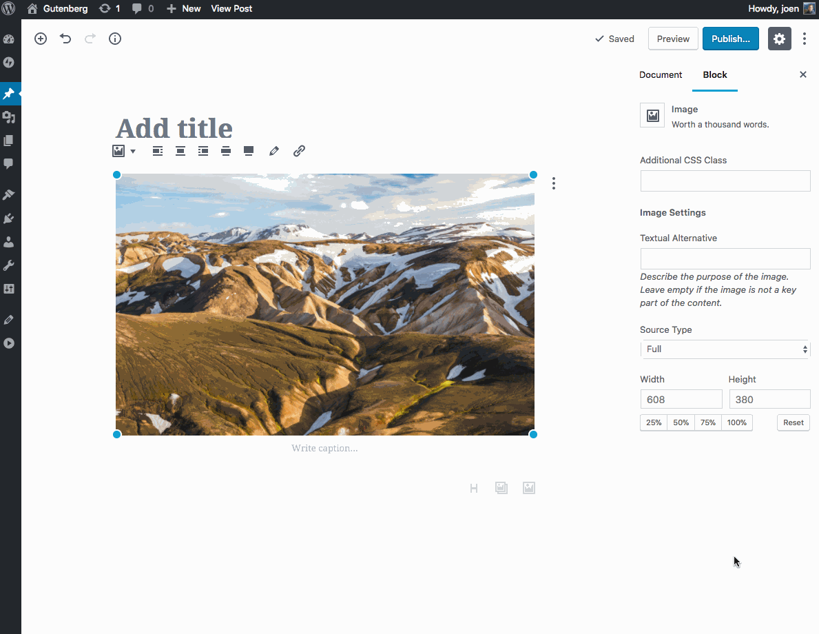
Description
Closes #4914.
Let users manually set the width and height of an image either using a text field or by a preset percentage amount.
How Has This Been Tested?
In all cases, the width value, the height value, and the size of the image in the editor should reflect the entered size.
Screenshots (jpeg or gifs if applicable):